Forging a new world of value creation beneath the surface.
Back in 2016, Magnus Kjelland-Olsen and Johan Hellstrøm founded JM Robotics — in their garage. (What is it with successful startups and garages?!) Fast forward six years, and these two visionaries are one of Scandinavia’s leading suppliers of custom designed ROVs.
With over 30 years of extensive first-hand subsea, commercial diving, and ROV experience, Magnus and Johan know what it’s like to operate below the surface. They had the confidence and ambitions needed to embark on a global adventure — they had a rock solid product — now they just needed a brand that says we know our shit!
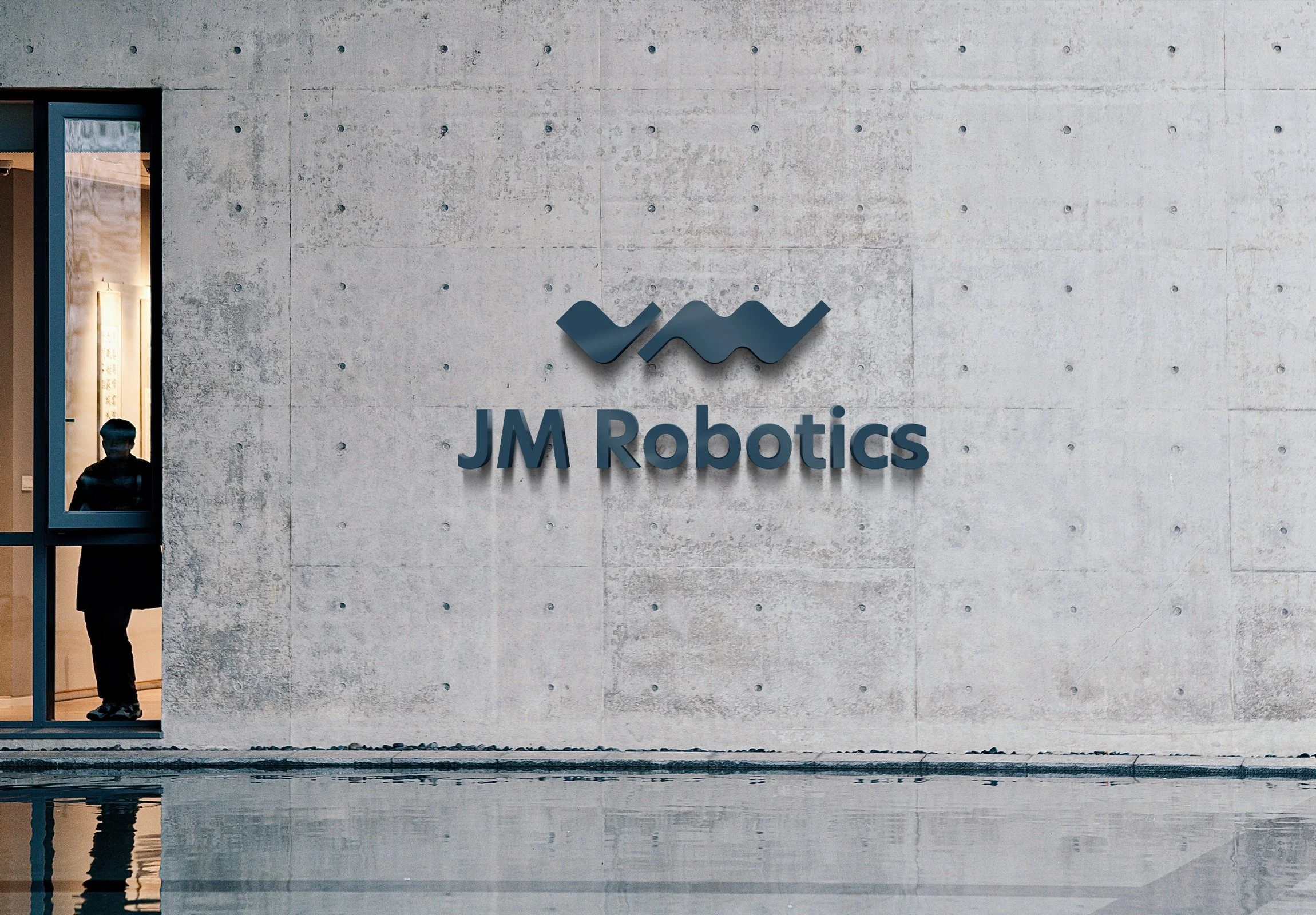
JM’s existing logo combined the founders’ initials J and M with a wave shape — and while I could appreciate the idea behind it, the execution was dated and not at all representative of the vision Magnus and Johan had for their brand.
Solution: I re-interpreted and refined the concept, to create a sleeker, bolder vibe.
We don’t follow the beaten track — we forge our own.
— JM Robotics
The logo icon was used as a base for a decorative surface pattern, adding depth and interest to the identity. The decorative element also gives visual associations to waves, and to light reflecting through the water.
To retain brand recognition, and as a visual link back to the original brand identity, we kept blue as a base colour but went deeper and darker, for a more high-end look.
The addition of signal yellow as an accent colour elevates the colour palette and demands attention — and it made total sense, since JM’s flagship product was already very distinctly yellow.
Your brand next?
I'd love to help you build a brand that truly represents what you stand for and the vision you have for your business — and the world. When you work with me, you'll get a gorgeous visual brand identity that communicates the essence of your brand and helps you attract + connect with your dream clients. Book a call or find me on Voxer for a chat about your options over a virtual cuppa!


